
On a small cassette insert, the teeth of a thrash logo can collapse into a dark blur. Put the same lettering on a shirt and it may be readable across a venue. A band mark had to look aggressive, but it also had to survive photocopying, printing and a quick glance at a concert bill. Finnish thrash bands drew on an international visual language of speed and impact, adapting it to their names, audiences and release formats.
A logo is the recurring treatment of a band’s name, whether drawn by hand, typeset or assembled digitally. It is not the same as cover art: the sleeve can change while the mark stays put. That distinction matters when tracing its history. A new color behind familiar lettering is not necessarily a redesign, and an unfamiliar typeface on a poster may be the promoter’s choice rather than the band’s.
The sharp-letter inheritance
International thrash established much of the vocabulary Finnish musicians could draw on: extended strokes, pointed ends, tight spacing and letterforms that suggest motion or damage. Those devices appear in other metal styles too. A jagged outline alone does not make a logo thrash; the association comes from the lettering, the music and the mark’s repeated use on records and show material.
Finland’s earlier thrash generation offers a point of comparison for the late-2000s revival. Stone’s name has often appeared as a compact, bold wordmark rather than a near-unreadable thicket of branches; a short name lends itself to that treatment. Still, surviving sleeves, photographs and reissues need careful handling. The name can look different across editions or release designs, so a collector should identify the original object before treating a reproduction as evidence of the original logo.
Mokoma tells a different story about continuity. Formed in the 1990s, the band moved through stylistic territory before becoming closely associated with Finnish-language thrash. Its visual identity cannot be read as a drawing of its sound at any one moment. A recognizable name mark can remain in place while the music and artwork change; a radical-looking sleeve does not, by itself, mean a permanent change to that mark.
For younger bands active around the end of the 2000s, classic thrash lettering was a deliberate reference, not a new invention. A pointed logo could declare an affinity with the tradition before anyone heard a note. But there was no single Finnish revival style. Some groups preferred compact lettering that held up on posters and shirts; others used elaborate outlines better suited to an album cover.

What changed between a demo and a wider release
Independent releases put visual consistency to the test. A band making a demo might need the same name on a sleeve, CD-R insert and show flyer without having a formal design system. A drawing made for one image might fail in another. A revision could be as modest as opening up the spaces inside letters, thickening narrow strokes or removing flourishes that vanished at small sizes.
Those are possible reasons for a change, not evidence of any particular band’s intentions. To establish a redesign, compare dated objects: a demo insert, a later independent release and a shirt from the same period, for instance. Did the underlying letter shapes change, or did scale, ink and background color create the difference? An enlarged digital image is especially easy to misread; it may be a later reconstruction of a mark first printed at low resolution.
Between the late 2000s and the mid-2010s, the same name also had to work in physical and digital settings. An outline that filled a record sleeve could turn illegible as a small profile image. That did not always call for a new logo. A band might use a full-width mark on a sleeve or backdrop, a simpler one-color version on merchandise and plain text where clarity mattered most. These are parts of one visual identity, not automatically successive eras.
Revision, variant or replacement?
- Revision: the basic letter shapes remain, but spacing, line weight or individual details change.
- Variant: the established mark appears in another color, texture or simplified printing form.
- Replacement: substantially different lettering or an arrangement takes over recurring use across releases and promotional material.
Recurring use is the test for that last category. A tour poster may set every band’s name in one typeface; a guest artist may redraw a name for a single cover. Neither proves the usual mark was abandoned.
Legibility as a musical and practical choice
Thrash logos often sit between plain wordmarks and the deliberately hard-to-read marks found in some extreme metal. Styles overlap, but a concert bill rewards lettering a viewer can recognize quickly. On a shirt, the mark works both as an emblem for fellow fans and as a readable name for someone seeing it for the first time.
Its shapes can suggest musical character. A slant or swept stroke implies velocity; heavy blocks suggest weight, and ragged edges imply abrasion. These associations tell us little about how fast or aggressive a band actually sounds. A clean logo can be just as committed to thrash: strong contrast and a recognizable silhouette may hit harder than another row of spikes.
Color changes the impression too. Red lettering can look incendiary against black cover art, while the same drawing in white on a dark shirt looks spare. Silver effects and distressed textures can evoke worn metal or damaged print. When comparing two logos, imagine each as flat black lettering on white. If the contours match, the difference is probably in presentation rather than the design.
Scale poses its own problems. On a sleeve, a thin cut may keep two letters distinct; on a festival running-order graphic, it may disappear. Recurring marks that leave enough open space around distinctive letters tend to survive reduction. That is one reason a logo can become simpler without losing its aggressive outline.
Finnish names, borrowed conventions and distinct identities
Nationality alone rarely determines a logo. Finnish thrash belongs to an international musical tradition, and its bands have shared bills and audiences with groups beyond Finland. Angular capitals and distressed lettering are not uniquely Finnish. The more revealing question is how a particular band name fits those conventions.
A short name can hold together as a dense, symmetrical emblem. A long one may need narrower letters or a horizontal sweep to fit across a cover. Double letters, unusual consonant combinations and diacritics present their own layout problems. A designer might stress a repeated shape or give a marked character extra room so it survives small print. Compare sleeve fronts, disc labels and merchandise to see those decisions at work; a single large image may conceal them.
For bands singing in Finnish, the language can affect what an international viewer notices first. Someone unfamiliar with a word may remember its outline before its spelling. A stable silhouette is useful on a European bill alongside groups from several countries. But a logo cannot establish touring plans or intended audiences on its own. The object shows how the name was presented, not the full thinking behind it.
Lost Society, which emerged in the early 2010s, shows why broad period labels have limits. A newer thrash band could reach listeners through recordings, live shows and online promotion in a short span, making a repeatable name mark useful in several places at once. That differs from a 1980s band’s early cassette-and-vinyl setting. It does not mean every later logo grew cleaner or every band followed the same course.
Where the logo lived
Band marks circulated well beyond records: on local posters, venue listings, shirts, patches and sometimes stage backdrops. Each surface posed a different test. A sleeve could carry fine detail and carefully chosen color; a photocopied flyer lost subtle shading. Embroidery and small patches needed broad shapes that would survive stitching. A support act’s space on a crowded bill might be a fraction of the space its logo filled on its own release.
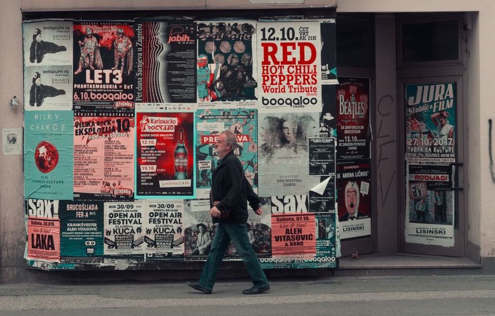
Concert material is useful evidence, though it has limits. A poster shows how a name was presented to an audience at a particular time, but not always who supplied the artwork. The promoter might have downloaded a low-resolution file, adjusted its contrast or typed the name instead of using the band’s mark. A merchandise-table photograph can confirm that a version appeared on a shirt, while folds and poor light may hide the printing details.
Festivals add another layer of control. A lineup spanning several metal styles may standardize names for clarity while separate promotional images retain each band’s logo. That shared typeface is the festival’s design decision, not necessarily a change in every act’s identity. European tour posters likewise show how Finnish bands appeared outside their local scene, but their typography should be checked against releases from the same period before attributing it to the bands.
How to trace a logo without inventing a timeline
A sound visual history begins with datable objects. First editions of recordings, dated show posters and merchandise photographs tied to an identifiable event tell us more than an undated logo file found online. Keep reissues separate: they may reproduce old art faithfully, redraw it from a poor source or pair an early recording with later branding.
- Record the artifact. Note whether it is a sleeve, insert, flyer, shirt or digital announcement, and date it as precisely as the object allows.
- Separate lettering from treatment. Compare contours and spacing before color, texture or surrounding illustration.
- Check repeated use. Find the same form on more than one band-controlled item before calling it an established logo.
- Keep uncertain dates uncertain. An undated shirt can help compare designs, but cannot prove when one first appeared.
Catalog photographs help, but a physical copy can settle questions that a low-resolution scan cannot: whether a thin line was printed, whether the metallic effect is in the ink, or whether a blur is just wear on that copy. The back and spine may also show a different version of the name from the front. Neither automatically outranks the other; they show adaptations to different spaces on the same release.
Try placing a dated demo insert beside a later album sleeve and covering everything but the band name. If the silhouette matches but the later version has clearer gaps between letters, describe that alteration rather than proclaiming a new aesthetic era. If the lettering is entirely different, look for it on a poster or shirt from the same period. That second object may distinguish a lasting replacement from a cover designer’s one-off choice.
What a logo cannot establish on its own
It is tempting to connect a visual change to a lineup shift, record deal or change in sound. A documented commission or statement may support that connection; resemblance alone does not. A cleaner wordmark could reflect a new designer, a printing constraint or a one-off layout. A rougher one could refer back to older metal graphics rather than signal more aggressive music.
Be just as careful with claims of influence. Lightning-like strokes and sharp capitals were widely shared genre conventions. Arguing that one Finnish band borrowed directly from another takes more than two similar outlines; dated sketches, credits or an account of the design process would make a stronger case. Without them, describe the shared vocabulary and what each name does with it.
For a final check, look at something small: the opening inside a single letter. On a well-preserved insert, that gap may tell you whether a later shirt carries the same drawing, a simplified variant or a redrawn mark.