
A thrash metal record cover does more than protect a vinyl disc. Before the needle drops, the artwork has already made a deal with whoever is holding it—promising a certain level of chaos, a set of obsessions, a sonic texture. During the Finnish thrash revival that gathered steam in the mid-2000s and hit its stride in the early 2010s, those covers developed their own unmistakable visual accent. It wasn't just Bay Area or Teutonic thrash reheated. Something Nordic had crept in: a comfort with rawness, a specific relationship with cold and wilderness, and a knowing nod to the genre's oldest visual habits.
You can't reduce this aesthetic to a tally of skulls and entrails. Those show up, sure, but they land differently in Finnish hands. Bands like Deathchain, Forced Kill, Axegressor, and Pyöveli kept reaching for apocalyptic imagery—except the apocalypse on their covers usually looked freezing. The color choices, the way things were drawn or painted, the motifs that kept returning: all of it added up to a regional school of design that ran parallel to the music's attack.
The Visual Signifiers of a Regional Sound
The first thing that hits you is how much of it was drawn or painted by hand. Digital collage and photo manipulation were cheap and everywhere by then, and plenty of metal subgenres had embraced them. But a big chunk of the Finnish scene stuck with ink, acrylic, and pencil. Partly this was ideological—it matched the broader Finnish Thrash Metal: A Unique Force in the Global Metal Scene insistence on something organic and unvarnished. A glossy, perfectly symmetrical Photoshop job would have felt wrong for music that thrived on a loose, live-wire energy.
Going with illustration also created a bloodline back to the 1980s work of Ed Repka and Dan Seagrave, though the Finnish artists rarely copied them outright. They took the dense, frantic linework of the old school and ran it through a more restrained filter—monochrome or two-color schemes were common. An American cover might scream at you in neon pink and electric blue. A Finnish one was more likely to work in stark black and white, blood red, and the muted gray of a winter sky.
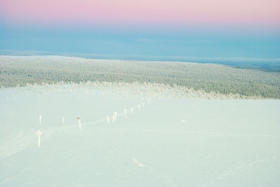
The subject matter circled a few fixed points. Nuclear annihilation kept appearing, a Cold War anxiety baked into classic thrash from the start. But in this visual world, the post-nuclear wasteland wasn't a desert. It was frozen tundra. Mutants trudged through snowdrifts. War machines corroded in boreal forests. Taking a global fear and giving it local geography made the imagery feel specific rather than rented.
Typography and the Cult of the Logo
You can't talk about thrash covers without staring hard at the logos. In the Finnish scene, the band logo was often the most obsessively worked part of the whole layout. The classic thrash mark—sharp angles, dripping tendrils, that chunky three-dimensional bevel—was treated with something close to religious seriousness. Bands put real hours into crafting a logo that would sit right on a patch vest next to the genre's established names.
What set a lot of Finnish logos apart was a faint but real bleed from black metal and death metal calligraphy. The borders between extreme subgenres were leaky in Finland, and a thrash band might weave in the more illegible, web-like structures of black metal lettering or the gore-drip excess of death metal, all within a structurally rigid thrash frame. That hybrid created a visual friction that echoed the music's own habit of accelerating past standard thrash tempo into blast-beat territory.
Where the logo sat mattered too. Centered and symmetrical, crowning the artwork like a monarch, it signaled a commitment to classicism. Asymmetrical placement, or a logo half-hidden behind a foreground element, hinted at something more narrative-driven or experimental. Album titles and track listings, when they appeared on the front at all, were usually an afterthought—a plain bold sans-serif that knew better than to compete with the logo's ornate aggression.
The Role of Independent Labels and DIY Production
The visual coherence of the Finnish thrash wave didn't happen by accident. It grew out of the infrastructure that produced it. Tiny, fiercely independent labels like Violent Journey Records and FullHouse Records acted as curators, working closely with a small circle of visual artists who understood the subculture from the inside. The relationships were collaborative. An artist might play in another band. A label owner might give specific art direction so a release fit a recognizable catalog identity.
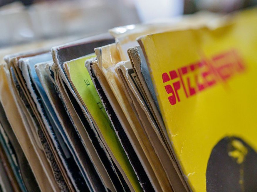
In this DIY ecosystem, album covers were almost never the result of a detached commercial design brief. Budgets were minimal, and the constraint usually sparked invention rather than killing it. High-contrast photocopied textures, deliberate grain, uncoated cardboard stock—these weren't just corners cut to save money. They were aesthetic decisions that reinforced the music's raw edge. A slick, major-label-style cover would have read as a betrayal of the underground values holding the whole scene together. Holding a Finnish thrash record meant feeling the matte finish and catching the faint smell of screen-printing ink. That tactile experience was part of the statement.
Recurring Motifs: From the Reaper to the Reactor
Some images kept coming back often enough to form a local iconography. The Grim Reaper, a thrash staple everywhere, showed up here as a physical, armored figure—sometimes swinging a scythe that morphed into a firearm. Skulls were unavoidable, but they tended to appear in piles or whole landscapes, a "skullfield" suggesting industrialized mass death rather than personal mortality.
Technology worked as a double-edged symbol. Nuclear reactors, cooling towers, toxic waste barrels—these pointed to an anxiety about humanity's self-destructive cleverness. But the same covers sometimes lingered on military hardware with a technical precision that bordered on fetishism: tanks, fighter jets, gas masks rendered in loving detail. That ambivalent relationship with technology, power source and doom vector at once, was a thematic undercurrent that lifted the best Finnish thrash covers past simple shock value.
The Crossover with Underground Comics and Zine Art
One influence that doesn't get talked about enough is underground comics and fanzine culture. Finland had a sturdy network of self-published zines running before and alongside the thrash revival. The visual style of those zines—scratchy linework, grotesque caricature, a deliberate refusal of polished mainstream comics—bled straight into album art.
You can see the crossover in how some covers tell a story. Instead of one big iconic image, the artist packs the frame with a chaotic tableau of small, violent vignettes. Your eye wanders across the cover, discovering fresh atrocities in the margins. This "Where's Waldo of Wickedness" approach rewarded repeated close looking, which suited the vinyl LP format perfectly. It also showed a punk disregard for commercial design rules that demand a single clean focal point.
The Evolution of Color and Texture
The revival's early wave leaned hard on monochrome with red accents, but as the scene moved into the early 2010s, the color palette started shifting. Sickly yellows, toxic greens, bruised purples crept in. These colors were never bright or saturated. They looked muddied, as though filtered through a layer of grime. That "dirty" palette became a production signature, sonically and visually. It matched the guitar tones bands were chasing—overdriven but not digitally pristine, loud but not clean.
Texture mattered just as much. Artists simulated rust, decayed flesh, peeling paint through stippling, cross-hatching, and other labor-intensive manual techniques. When digital tools entered the process, they were often used to degrade an image rather than perfect it—adding noise, faking film grain, mimicking a worn-out VHS tape. This obsession with texture tied the visual art to the wider Exploring the Finnish Thrash Metal Phenomenon, where authenticity was measured in visible wear and tear, whether on a denim vest or a record sleeve.
The Influence of Finnish Landscape and Mythology
Thrash is a fundamentally urban and suburban genre, but the Finnish version couldn't quite shake the gravitational pull of the country's landscape and mythological heritage. Direct depictions of forests, lakes, and snow weren't as common as in folk or black metal, but they appeared in mutated form. A forest might be a charred, skeletal remnant after a nuclear blast. A lake became a reservoir of toxic sludge. The natural world was present, but it was nature that had been irrevocably poisoned by human violence.
Mythological references tended to be indirect and filtered through a horror lens. You might spot a creature that echoed the shape of a Hiisi or a troll, but it would be rendered with the anatomical detail of a biological specimen, not a fairy-tale illustration. Grounding the mythic in the visceral, biological grotesque separated Finnish thrash covers from the more fantastical, sword-and-sorcery imagery of some power metal traditions.
Legacy and the Collector's Perspective
For people who still buy physical media, the Finnish thrash scene of this period represents a high point in the album cover as a total package. The attention to detail carried through to inner sleeves, center labels, lyric sheets. A release was a cohesive artifact, with the visual theme often continuing from front cover to back in a single wraparound illustration. The visual artist's credits were displayed prominently—the artwork wasn't packaging, it was an integral component of the release.
That holistic approach to visual presentation is why these records remain sought-after now. The aesthetic is specific enough to be instantly recognizable to someone who knows the terrain, yet varied enough in execution to reward deep exploration. It stands as a record of a moment when a geographically isolated but fiercely connected group of musicians and artists built a complete visual and sonic world, using nothing more than their own skill and commitment to an underground ideal.