
On a Finnish thrash shirt from the late-2000s revival, the design had a job to do. Limited runs sold from club tables needed to make a band name visible across a dim room, while the back could carry a slogan, release title, or compact tour print. That need shaped the look: high-contrast ink, forceful lettering, and images that stayed legible after repeated wear.
For collectors and scene archivists, these garments are useful primary sources. A shirt may preserve an early logo, a short-lived line-up credit, a demo title, or a local-show reference absent from formal discographies. Context matters as much as condition.
What made the designs read as thrash
Classic thrash supplied the basic visual vocabulary: sharp hand-drawn logos, skulls, weaponry, ruined cities, radiation symbols, military imagery, and comic-book exaggeration. Finnish bands active between the late 2000s and mid-2010s drew on those cues without treating them as museum pieces. The imagery sat naturally beside fast down-picked riffs, abrupt rhythmic changes, shouted hooks, and deliberately direct production.
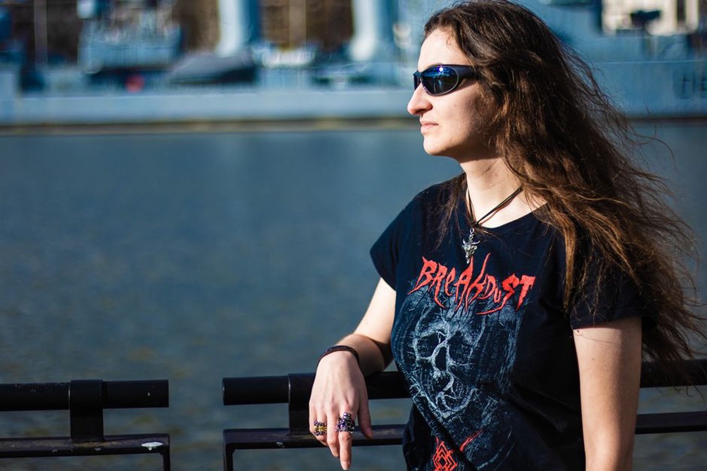
The best prints relied on hierarchy rather than clutter. The band logo usually dominated the chest, with a central illustration establishing the identity of a particular release period and a title or short phrase supplying secondary information. If every element was equally large, the shirt became hard to read. If the logo vanished into detailed linework, it stopped functioning as merchandise in a crowded room.
Logo treatment and type
Typography was often the most durable part of a band’s visual identity. Thrash logos favour angular strokes, uneven edges, speed-line diagonals, metallic bevels, and lettering that suggests corrosion or impact. A T-shirt logo, however, had to meet a different standard than a flyer or sleeve seen at close range: narrow gaps and fine outlines could fill with ink or disappear after washing.
Designers often simplified logos for screen printing. A detailed version might suit cover art, while a one-colour chest print called for heavier outlines and fewer small cuts. That was not a loss of artistic intent, but an adaptation to fabric, ink, and viewing distance.
From rehearsal-room economics to print choices
Independent Finnish thrash bands generally worked with modest merchandise budgets, particularly around a demo, EP, or first album. One- and two-colour prints were cheaper to produce consistently and suited the genre’s underground traditions. Black shirts with white, grey, red, or yellow ink were common because they produced strong contrast without requiring a large palette.
A limited colour count could sharpen a design. Red might be reserved for blood, warning symbols, or a release title; white could carry logos and line art; black worked as both background and negative space. On fabric, that often read more clearly than a full-colour image with detail lost in the print.
- One-colour print: effective for early logo shirts, event merchandise, and clear line illustrations.
- Two-colour print: adds emphasis while keeping registration manageable and costs comparatively controlled.
- Large back print: suits a tour list, a large emblem, or an alternate image not used on the front.
- Sleeve print: works best for a short wordmark, symbol, or release year rather than dense information.
Print quality also matters when interpreting surviving examples. Screen printing usually leaves an ink layer that can crack with age, while direct-to-garment printing behaves differently and was not the default for many small runs in this period. A worn shirt is not automatically inauthentic: fading, cracking, and softened fabric are expected on garments carried through rehearsal rooms, clubs, and festivals.
Artwork beyond the album cover
Merchandise gave bands room for secondary imagery. A shirt might feature a mascot, a stylised weapon, a satirical authority figure, or a fragment of a larger cover composition. This let a group extend its aesthetic across several items without repeatedly printing the same sleeve art. It also tied shirts to live culture, where a design could act as a recognisable uniform for supporters while remaining distinct from the record.
Some of the most revealing designs use references understood within thrash culture rather than highly specific narrative scenes. Torn lettering, chained emblems, gas masks, and skeletal figures communicate intensity quickly. Their value depends on execution. A familiar trope gains meaning when it fits a band’s name, lyrical outlook, and musical character instead of appearing as generic metal decoration.
The relationship between visual themes and songs needs careful reading. Political or dystopian art may reflect lyrical concerns, but it should not be taken as proof of a precise message without confirmation from the release, lyrics, or credited artist. For a wider discussion of how Finnish thrash songs built their narratives, consult Finnish Thrash Metal’s approaches to storytelling.
How to date and document a shirt responsibly
Dating a garment by style alone is unreliable. A band may reprint an older motif years later, use leftover blanks, or change only the label while retaining the original artwork. Better documentation combines several visible and recorded details.
| Detail to record | Why it helps |
|---|---|
| Front, back, sleeves, neck label, and inside print | Captures the complete design and production clues |
| Exact wording and spelling | Distinguishes release titles, slogans, and possible reprints |
| Ink colours and print placement | Separates variants that share the same central illustration |
| Provenance | Records where and when it was obtained, without overstating certainty |
| Artist or printer credit | Connects the object to visual contributors when credited |
Photograph shirts flat in even light, and retain an unedited high-resolution file alongside a web-sized copy. Record measurements rather than relying only on the size tag, since blanks and sizing conventions vary. If an item is believed to come from a particular concert, describe that as reported provenance unless a dated flyer, official announcement, photograph, or contemporary sales record supports the claim.
Signs of a meaningful variant
A variant does not need to be rare to matter. It may carry a different printer credit, a revised logo, an added European date block, or an alternate back design. Such changes can indicate shifts in a band’s working methods or touring activity. Catalogue them descriptively rather than making unsupported claims about scarcity.
Care is straightforward but important: wash printed shirts inside out in cool water, avoid high dryer heat, and keep them out of prolonged direct sunlight. For archive storage, fold rather than heavily hang printed garments, place acid-free tissue between tacky or fragile ink surfaces, and assign each item a simple identifier: band name, design description, colourway, and known acquisition date.
A practical catalogue entry might read: Band name — black cotton shirt; white front logo above red central illustration; no back print; credited artist if present; acquired at a Finnish club show, date unverified. That kind of record preserves useful evidence without turning a memory into an invented release history.