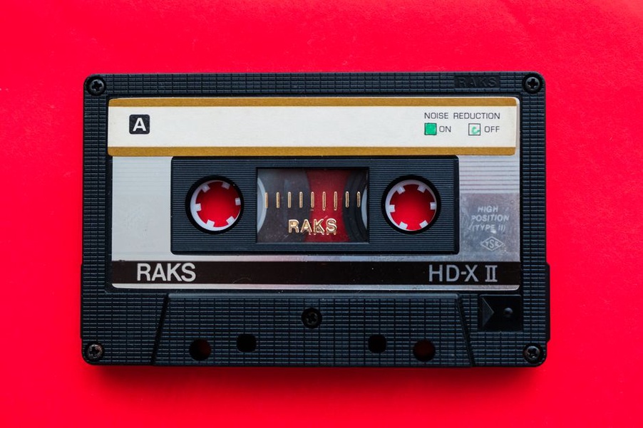
A scanned cassette insert may hold the only surviving track list for a Finnish thrash demo. Publish the scan without a transcription, and a reader using a screen reader cannot read the track names; nobody can search for them as text, either. The scan remains valuable evidence. Text beside it makes that evidence easier to use.
Accessibility runs through the whole archive: finding a band, opening an entry, examining a source and understanding what it says. Small music sites can make those tasks easier without giving up dense discographies, release photography or the look of the records themselves.
Start with the archive’s most important paths
Pick a few things visitors come to do before editing individual pages. Follow a band entry through to its releases; compare two versions of a track list; try using the contact form to correct a venue name. Work through each task with a keyboard and, if possible, a screen reader. Problems that barely register on a desktop screen often become obvious.
Fix the obstacles that stop a task first: a menu that cannot be opened, an unlabeled search field or a form error that cannot be identified. Then look at recurring templates. Repairing the release-entry template can improve dozens of entries; fixing one isolated page cannot.
Make navigation work without a mouse
Keyboard users generally move between interactive elements with Tab, then activate links or buttons with Enter or Space, depending on the control. Try reaching the search box, opening menus, following release links and submitting a correction without touching the mouse. Keep the focus indicator visible throughout. On a dark site, its outline must be clear against both black backgrounds and brightly colored artwork.
Watch the order as well. If Tab moves from the site logo to a link near the bottom, then back to the menu, the underlying page order may be confusing. It should follow the visible reading order. An expanding menu needs a button that communicates whether it is open, and the menu must neither trap focus nor disappear while someone is using it.
A skip link lets visitors bypass repeated navigation and go straight to the main content. That matters when a long band list or category menu appears on every page. Check that activating the link actually moves focus to the content, rather than only changing the URL fragment.
Give long entries a readable structure
A release entry may contain personnel, recording notes, format variations, photographs and uncertain dates. Headings make it easier to scan and give screen-reader users a way to move between sections. Use one clear main heading, followed by section headings in a logical order. If a heading looks too large, change its styling rather than choosing the wrong heading level.
Keep paragraphs manageable and links specific. “Cassette edition track list” tells a reader where a link leads; “more” says little when it appears several times on a page. Spell out uncertainty, too: “Release year unconfirmed” is more useful than an unexplained question-mark icon.
Use tables only when the relationships need them
A discography with title, format and documented year columns is a good candidate for a table. Give the columns text headings and check how a screen reader announces each row. Do not use a table just to place a photograph beside a paragraph. If a discography runs too wide on a narrow screen, allow horizontal scrolling or use a simpler presentation; shrinking the text until it is hard to read is no fix.
A track list usually belongs in an ordered list. Sequence matters, especially when two releases have different running orders. Typing numbered tracks into one paragraph and spacing them into columns loses that structure.
Describe images according to their purpose
Alt text should stand in for an image, not repeat its file name. Beside an entry titled Demo 2011, “Demo 2011 cover” may be enough if the artwork adds nothing needed to understand the entry. A handwritten venue correction or a distinct pressing mark deserves an explanation in nearby text as well. Alt text is usually too short for a full transcription.
Decorative dividers need not be announced. An image used as a link, though, needs a name that explains where it goes or what it does. Hide the images during a test: can a visitor still tell the cassette edition from the CD edition and find the evidence for each claim?
Transcribe text that exists only inside scans
Flyers, sleeve notes and fanzine clippings can be central to scene history. Optical character recognition is a starting point, but stylized logos, worn photocopies and mixed Finnish and English text call for human checking. Put a corrected transcription near the image. Keep line breaks when they aid interpretation, and mark words you cannot read instead of guessing. Readers can then search the text, enlarge it independently of the scan and compare it with the original.
The transcription does not replace the artifact. Typography, corrections and physical wear may be visible only in the scan. Publishing both keeps the object available for close study while making its words accessible.
Keep type, contrast and zoom usable
Classic thrash design favors sharp lettering, dark backgrounds and saturated reds. An archive can keep that look without setting every track list in difficult type. Save elaborate lettering for artwork or short display elements; use clearly distinguishable characters for descriptions, navigation and lists.
Check the contrast of body text, small metadata, links, buttons and focus outlines against the backgrounds where they actually appear. A gray date that reads well on white may vanish over a textured flyer. Color alone should not distinguish a confirmed release date from an estimate. Add words such as “documented” or “approximate,” and explain symbols used across entries.
Set browser zoom to 200 percent and inspect a band page, a table and a form. Text should not clip, and controls should not cover one another. Check a narrow viewport too. Rather than disabling zoom or reducing type to fit a cramped layout, let content wrap and leave room for long names.
Make audio and video information available in text
A performance clip or interview may document a live arrangement, but some visitors cannot hear it or use its player. When speech matters, provide accurate captions or a transcript. Identify speakers where the distinction matters, and include non-speech details needed to follow the recording, such as a song beginning or an audience question.
For a music-only excerpt, a transcript cannot reproduce the sound. A short description can still explain what the clip documents: a live recording of a named song with a different intro from the studio version, for instance. Attribute dates and venue names only where the source supports them. Review automatically generated captions for names, lyrics and musical terms before publication.
Players need accessible play, pause, volume and caption controls. Avoid autoplay: unexpected audio can interfere with a screen reader and make the page difficult to use. If an embedded player does not work by keyboard, consider one you can test and control instead.
Fix search and forms at the point of use
Archive searches often need to handle band names, release titles and alternate spellings. Give the search field a visible label; placeholder text disappears when someone types and may not serve as a reliable label. Name filters clearly, show selected filters in text and announce changes to the results. If there are no matches, say so and give visitors a clear way to revise the query.
Correction and contact forms need plain labels too. Identify required fields before submission, connect each error to its field and keep what the visitor has already entered. Someone reporting a mistaken 2012 release date cannot act on “Invalid input”; “Email address is missing” tells them what to fix. For more on the information that page needs to convey, see the archive’s guide to writing a contact page for an independent music archive.
Do not make an image-based puzzle the only way to submit a correction. Anti-spam measures should leave a workable route for people using assistive technology. Check the confirmation message, too: a green checkmark alone is not enough.
Test with real content, then maintain the fixes
Automated checks can catch missing labels, contrast problems and some heading errors. They cannot tell you whether a flyer description explains why the flyer matters. Make a short manual pass through representative pages:
- Keyboard: reach every control, follow visible focus and check that menus and dialogs can be closed.
- Screen reader: review headings, link names, image descriptions, form labels and the reading order of a release entry.
- Zoom and narrow layouts: inspect long titles, discography tables, scans and error messages for clipping or overlap.
- Media: check captions and transcripts against the recording, especially names and dates.
Where possible, ask people who use assistive technology to try a specific archive task, and compensate them for their time. Their findings should guide the work, not replace basic testing by the site’s editors. Log problems against templates and components so they do not recur with every new entry.
On the next scanned insert, put a checked track-list transcription directly beneath the image. Keep the scan in place: readers should be able to compare the words with the artifact, not have to choose between them.