
On a Finnish thrash shirt from the revival years, a jagged white logo could catch your eye before the smaller lettering came into focus. Against black fabric, it had the punch of a photocopied gig flyer. It also had to read across a crowded club and hold up after repeated washing. Those practical demands shaped the look of the merchandise alongside the music’s attachment to 1980s thrash.
Merchandise gave a band a public identity, but it was also something sold face to face. For Finnish groups playing local shows, releasing records independently and taking European dates in the late 2000s and early to mid-2010s, a shirt could travel farther than a flyer. It connected its wearer to a band and sometimes to a specific tour or release. The trick is to read what the garment actually says, rather than treat every skull, hazard symbol or distressed letter as distinctly Finnish.
A visual language built for movement
Classic thrash offered plenty to work with: angular lettering, stark figures, radioactive greens, violent reds, comic-book exaggeration and scenes of social breakdown. Finnish bands of the revival period drew on those conventions without settling on a shared house style. Lost Society’s early visuals, for example, often favored thrash’s irreverent, kinetic side, in keeping with the speed and youthful energy of its breakthrough period. Other designs went darker or more stripped back, closer to traditional underground metal. Drawing style tells us more about how a band chose to present itself than about a national aesthetic.
Scale changes what works. A chest logo needs bold outlines and enough space between letters to remain legible. Fine lines might look good on a sleeve or printed insert, then vanish across a room. A back print has room for dates, a release title or a larger illustration without crowding the front logo. After all, these images are usually seen on moving bodies under uneven stage lights, not laid flat like cover art.
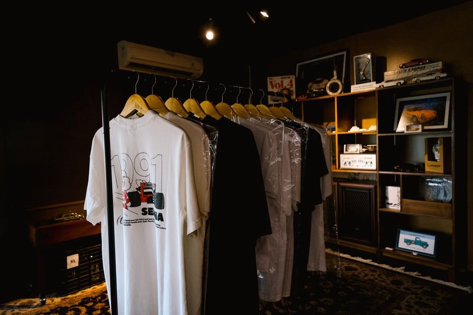
What the shirt borrows—and what it changes
Album covers and shirts often share a logo or central figure, making the connection easy to spot. Putting sleeve art on fabric still calls for changes. A square composition has to fit a torso; a complex palette may shrink to a few ink colors; small credits may disappear. The shirt is a version made for screen printing, cost and visibility, not simply an album cover you can wear.
Compare items tied to the same release and the differences become useful. One shirt might keep the title and central motif but replace the sleeve’s background with solid black. Another might add cities or a year to a familiar design to advertise a tour. Those details can help date the graphic, though a printed year tells you what the shirt promotes, not necessarily when that copy was sold.
Formats beyond the front-print tee
T-shirts are the most visible merchandise, but patches, badges, hoodies and smaller printed goods have their own uses. On a vest, a patch places a Finnish thrash band among the wearer’s other favorites—a personal map of the wider metal scene. A badge fits a jacket or bag and can carry artwork too small or simple for a shirt. A hoodie offers a larger, more durable garment, though its higher production cost may limit the designs a small band can keep in stock.
A logo can move between formats without looking quite the same. Stitched edges and limited space may force a patch to simplify lettering that reads clearly in a shirt print. That matters when comparing colors and letterforms: embroidery and ink are not interchangeable evidence. For the broader tradition behind these objects, Britannica’s overview of heavy metal places thrash within the genre’s history. The physical choices on any one item still deserve close attention.
Where provenance becomes part of the design
A list of dates on a shirt’s back looks like a record of events, but it needs careful reading. Tour shirts can be printed before all the advertised shows take place. Leftover copies may be sold afterward; an undated design may be reprinted years later. “Shirt advertising a 2013 tour” describes the graphic more precisely than “shirt bought on the 2013 tour” unless a receipt, photograph or credible firsthand account supports the purchase claim.
Small runs and direct sales can make surviving examples difficult to identify. Rarity alone does not prove a shirt was limited or official. Collectors and archivists can start with these details:
- Exact wording and spelling on both sides, including tour stops and release titles.
- Ink colors, print placement and any visible printer’s mark.
- Garment label, size and construction, recorded separately from the design.
- Any documented connection to a show, band sale or original owner.
No single detail settles authenticity. Taken together, they help distinguish similar shirts without leaning on memory or an unverified listing. A dated photograph of a musician wearing a design shows that the design existed by then; it does not establish who printed every copy now in circulation.

Local identity without a fixed national template
Finnish place names, Finnish-language text and references to particular shows can tie a piece to a local scene. But Finnish thrash merchandise need not display any of them. Bands also had to reach listeners beyond Finland as recordings and live appearances found European audiences. English titles and familiar thrash imagery made a shirt readable across borders without making its origins irrelevant.
A design made for modest show sales could speak in visual conventions metal fans elsewhere already knew. That connection reflects the music’s longer history, from Finland’s first wave to younger bands; the timeline from Stone to Lost Society gives context for those generations. Angular logos and aggressive illustration may suggest continuity, while changes in printing or garment choice can reflect different budgets and circumstances. Neither observation, on its own, proves one band directly influenced another.
To catalogue a piece, photograph both sides and transcribe every printed word before assigning a date. If the back reads “European Tour 2014,” record that wording exactly, then put the acquisition date in a separate field. The shirt’s claim and its owner’s documented history should remain distinct.