
A visitor looking for a band’s recordings shouldn’t have to guess whether they’re filed under “Music,” “Archive,” or “Media.” If that page leads to an authorized listening option or a legitimate place to buy a release, the label matters: it can determine whether the visitor finds it at all. The point of navigation isn’t to send everyone to the same button. It’s to make the next useful step easy to find.
For an independent music archive, that step might be finding a documented discography, checking a show listing, subscribing to updates, or reaching an official seller. Each calls for a different route. A collector may want pressing details before hunting for a copy; someone new to Finnish thrash may want some scene history before following a band. The menu should serve both without listing every page on the site.
Start with the visitor’s task
Before changing the menu, write down what people come to do: find a band, identify a release, compare editions, check a concert date, understand a musical term, or send the archive a correction. For each task, find the page that answers it best and decide what sensible next step that page can offer.
That can expose a gap between the archive’s filing system and a reader’s expectations. An editor may classify a scanned flyer as an “artifact,” but someone verifying a gig will probably look under “Shows.” The flyer can keep its archival classification while the menu offers a route that matches the reader’s task.
- Use “Bands” for an index of artist profiles, not a mixture of interviews and reviews.
- Use “Releases” or “Discography” where visitors can find recordings, formats, and release information.
- Use “Shows” for concert listings or documented live-history pages, with upcoming events clearly separated from past dates.
- Use “About the Archive” for the archive’s scope, sourcing practices, and correction information—not unrelated leftovers.
A label should describe what the click delivers. “Explore,” “Discover,” and “The Vault” may fit the site’s visual identity, but they tell a reader little about where to find a demo. If a distinctive name matters to the publication, pair it with a plain description rather than asking readers to learn the site’s private vocabulary.
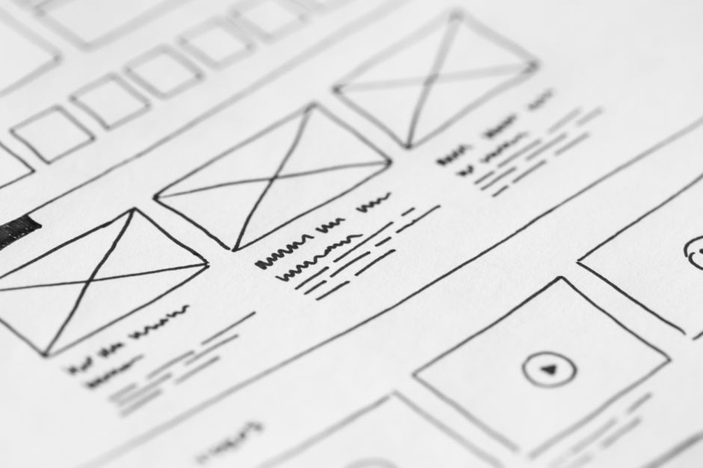
Make the main menu small enough to scan
The main menu should show the site’s principal destinations, not its full filing system. Put every topic, format, and temporary campaign at the top level and the choices become harder to tell apart. Group related pages under names readers will recognize.
A Finnish thrash archive might lead with “Bands,” “Releases,” “Shows,” and “Scene History.” A feature on riffs can sit within scene history or a relevant article category; it doesn’t need a permanent menu slot. The grouping has to reflect what the archive actually holds. If “Releases” is nearly empty, a well-maintained band index that leads to release pages may be more useful.
Use dropdowns only where they clarify a real choice
A dropdown can separate “Upcoming Shows” from “Past Shows,” or “Albums” from “Demos,” when there’s enough material in each section. It shouldn’t hide a single important page behind an extra click. On touchscreens, submenu items must work without hover. The parent label also needs a predictable job: either it opens an overview page or it expands the submenu. A visible arrow or separate control can make that clear.
Check the menu on a narrow screen. Five short labels that fit on a laptop may crowd a phone header, while a collapsed menu can bury the archive’s most useful section. If finding a release is a common task, keep “Releases” near the top of the mobile menu rather than several levels down.
Give each page a useful onward path
Visitors often arrive somewhere other than the homepage. A search result might drop someone directly into an article about a concert recording, with none of the context the homepage supplies. That page should make two things clear: where it sits in the archive and where the reader can go next.
Breadcrumbs can show a consistent hierarchy, such as “Shows › Past Shows › Helsinki.” A well-placed link in the article can be more useful than a generic “Related Content” box. An article comparing musical approaches, for instance, could point readers to Finnish Thrash Metal: Hearing Tradition and Change for broader listening context. They know what to expect before clicking.
Choose related links to fit the page. A band profile might lead to its releases and documented show history. A release entry might lead back to the band, on to format notes, and to an official seller if one exists. Put a correction form near disputed or incomplete archival details, rather than giving it the same visual priority as a purchase option.
Keep calls to action honest
Say what the action does: “View release details,” “See documented shows,” or “Subscribe to archive updates.” “Get the album” is misleading if the link leads only to a review. If an older recording has no authorized seller, say so instead of sending readers to an unrelated page.
A release entry can offer several actions without giving them equal weight. Put the track list and edition details where readers can find them first, followed by a clearly identified official buying option. A newsletter invitation can sit further down. The reader came for information about the release; give them that before asking for a decision.

Build trust into the route
Labels affect confidence as well as speed. If “Past Shows” mixes confirmed appearances with undated flyer scans, readers may not know what has been verified. Brief explanations can distinguish a dated concert entry from material still under research. Keep names consistent, too: a menu item called “Discography” shouldn’t land on a page headed “Merchandise” unless the connection is explained.
The same routes need to work for people using a keyboard or assistive technology. Use text labels rather than icons alone, make keyboard focus visible, and keep the tab order logical. Menu controls should announce when a submenu is expanded; link text should still make sense away from its surrounding sentence. Try opening and leaving each dropdown with a keyboard. A polished-looking menu is little help if the content behind it is hard to reach.
Test paths, not just clicks
Judge a menu change by the task it was meant to support. More clicks on “Releases” mean little if readers leave because they can’t find the format details they expected. Follow the route from entry page to answer, noting where people backtrack and whether they finish. The site’s own search terms can reveal missing labels, too: repeated searches for “demos” suggest that term may need a clearer route.
A small usability check can explain what analytics cannot. Ask someone unfamiliar with the site to find out whether a named release has a vinyl edition, then watch where they click without steering them. If they keep opening “Shop” while the answer sits under “Discography,” look at the label or the grouping before blaming the visitor.
Change one meaningful element at a time when you can, then test the whole path again. Open a band profile on a phone, find its releases through the menu, and reach the edition details using only keyboard controls. Write down every label that promises one thing and delivers another. That list is a practical place to start the next round of edits.