
Before a note is heard, a Finnish thrash sleeve from the late 2000s or early 2010s often states its allegiance: serrated lettering, distressed paper textures, a restricted palette, and images of collision, decay, surveillance, war, or urban ruin. These were more than retro gestures. For independent bands taking part in an international thrash revival, artwork distinguished physical releases, signalled a connection to the genre’s history, and offered listeners a visual route into local circuits of gigs, tapes, CDs, and vinyl.
A sleeve is best read alongside its logo, insert, and merchandise rather than as a standalone illustration. The cover may draw on 1980s thrash conventions, while credits, catalogue numbers, thank-you lists, and band photographs reveal the scale of the release and the community around it. This matters in Finland, where younger revival-minded groups worked within a country already known for its long and visible metal tradition.
Artwork as a declaration of genre
Thrash metal visual language grew out of recurring associations: speed, social disorder, black humour, confrontation, and deliberately rough-edged intensity. Finnish bands and artists could draw on those associations without reproducing a single classic model. The results were usually recognisable as thrash at first glance, yet shaped by the resources available to a band and the needs of a particular release.
Three broad approaches recur during the period:
- Illustrated catastrophe: hand-drawn or digitally assembled scenes of explosions, skeletal figures, military hardware, polluted environments, or ruined cityscapes. These designs place the music in familiar thrash territory: excess, threat, and spectacle.
- Raw graphic minimalism: stark logos, black-and-white imagery, photocopied textures, heavy type, and limited colour. This overlaps with punk and hardcore’s DIY print culture and worked well for demos, small runs, and compact formats.
- Dark atmospheric realism: winter scenes, industrial settings, anonymous figures, and subdued photography. Such work could give an album a harsher, more spacious feel without claiming a separate national style.
These are tendencies rather than rules. Finnish thrash was not visually uniform, and a single band might move between comic-book violence, formal studio portraits, and sparse layouts as budgets, collaborators, or musical direction changed.
Why “Finnish” should not become a shortcut
Snow, forests, blue-and-white colour schemes, and bleak architecture can be tempting shorthand for a distinctly Finnish metal aesthetic. They may appear, but none of them proves much on its own. Thrash artwork drew from international sources: Bay Area thrash, German speed and thrash metal, crossover, punk zines, horror illustration, tape-trading culture, and the visual conventions of European metal labels.
A more accurate observation is that Finnish releases emerged in a culture where musicians and listeners already understood metal subgenres, visual codes, and physical formats. That familiarity allowed for small but meaningful choices. A logo could remain deliberately readable rather than become death-metal indecipherable. A cover could invoke classic thrash without explaining the reference. A cassette insert could carry the same identity as an LP sleeve at a much smaller scale.
Locality is usually easier to trace through context than through symbols. The language of acknowledgements, the people thanked, venue flyers reproduced in an insert, the choice of local photographer or illustrator, and contact details can all reveal more about scene participation than an assumed reading of weather or scenery.
Reading the components of a release
The logo: legibility, aggression, and continuity
A thrash logo has a practical purpose: it needs to remain recognisable on a poster, patch, social profile, CD spine, or cramped cassette J-card. Finnish bands active during the later revival often used angular lettering, sharp terminals, heavy outlines, and hand-rendered irregularity. The effect suggests speed and danger, while helping a band remain visible on crowded bills.
Logo changes are worth noting. A cleaner mark may coincide with larger stages or wider distribution; a more intricate version may suit a darker or more technical record. Neither automatically signals a change in authenticity. It may reflect a new designer, a different printing method, or the need to make a name work at another size.
Colour and printing limits
Red, black, grey, dirty yellow, and military green recur because they evoke danger, corrosion, violence, and aged print. Colour choices were also tied to cost. Independent releases often had to work within small print runs, limited budgets, or the available sleeve and insert options. A two-colour design could be both an aesthetic choice and a production necessity.
Collectors should not treat imperfections as automatic proof of rarity or originality. Ink variation, crooked folds, rough trimming, and duplicated textures are common in DIY production, but they can also appear on later reproductions. Provenance matters more: compare catalogue information, print quality, credits, matrix details where applicable, and the source of the item.
Typography and the social life of sleeves
Small print is often where a release becomes historically valuable. Track listings show whether a record balances brief attacks with longer compositions. Personnel credits document a line-up at a particular point in time. Thank-you lists may identify studios, promoters, fellow bands, labels, and friends who made up the working support around a group. Distribution addresses and mail-order notes also recall a period when physical circulation still mattered, even as online platforms became more important.
The relationship between digital presentation and physical design was especially important during these years. Cover art had to work as a thumbnail while rewarding close inspection on a sleeve. Online networks changed how bands shared announcements and imagery, as explored in the account of thrash metal’s digital and social-media connection, yet a tangible release remained a collectible document of scene activity.
Artwork and the live environment
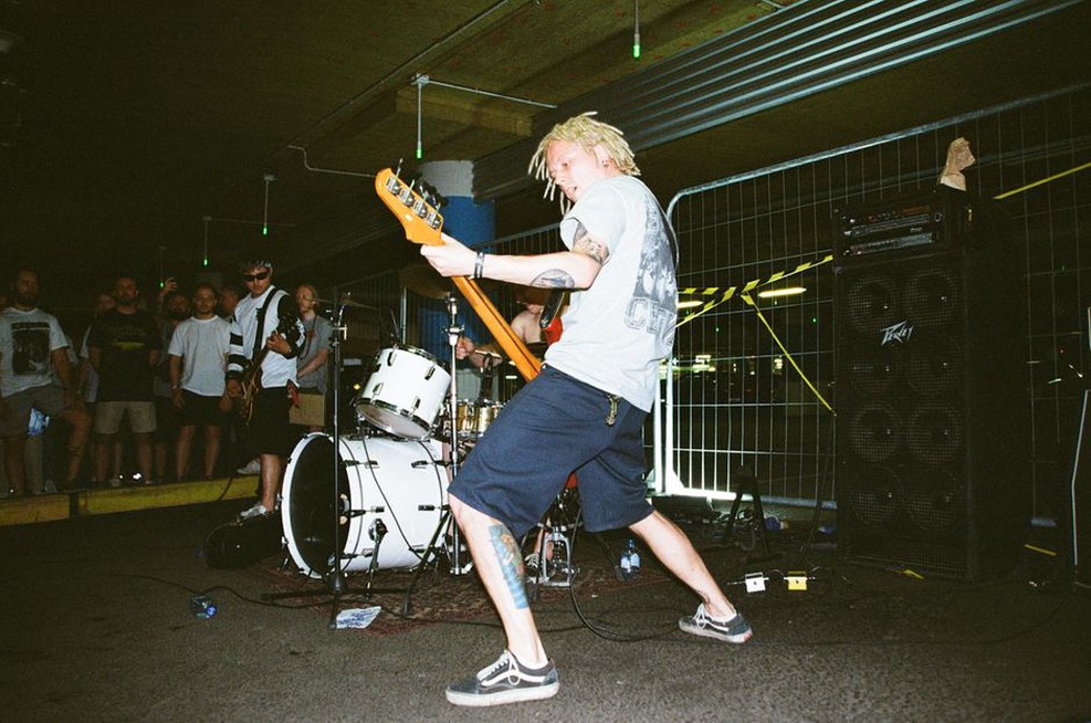
At club shows, visual identity extended well beyond the album cover. Backdrops, banner logos, shirt prints, handwritten merchandise signs, and flyers brought release imagery into a shared physical space. Thrash depends on immediacy: a strong logo or high-contrast graphic must remain readable in low light, amid movement, and on a packed support bill. That practical need helps explain why some of the most effective designs are relatively simple.
Festival appearances and European dates carried this visual vocabulary beyond Finland, without requiring bands to shed their local connections. Posters placed a group’s designs beside promoters’ layouts, other bands’ logos, and venue-specific habits. Tour shirts, flyers, and date-specific posters can therefore be as useful to an archive as the main album cover. For the touring framework of the era, Finnish thrash bands on the European road from 2008 to 2015 provides relevant context.
A practical method for analyzing an artwork
- Identify the object. Establish whether it is a demo, EP, album, reissue, flyer, shirt, digital single image, or promotional poster. The intended format shapes the design.
- Separate observation from interpretation. Record visible facts first: colours, medium, text, figures, symbols, names, and printing style. Then consider the associations those features may create.
- Compare within the band’s own catalogue. A change carries more meaning when viewed across successive releases than when measured against a generic idea of Finnish metal.
- Place it beside contemporary scene materials. Examine bills, labels, merchandise, and releases by peers active in the same period. Shared design choices may point to networks rather than imitation.
- Check credits and editions. Record the illustrator, designer, photographer, layout artist, printer, and label when named on the release. Attribution is better than guessing from style alone.
What artwork can and cannot prove
| Visual evidence | Reasonable reading | What it cannot establish alone |
|---|---|---|
| Photocopied or distressed layout | DIY influence or an intentionally raw visual texture | That a release was necessarily self-financed or produced in tiny numbers |
| Classic thrash imagery | Genre affiliation and dialogue with older metal traditions | That the music copies a specific 1980s band |
| Finnish landscape or language | A possible local reference or cultural framing | A unified national aesthetic shared by all Finnish thrash bands |
| Multiple logos and poster styles | Different collaborators, formats, or phases of presentation | A definitive change in musical quality or credibility |
For archival notes, begin with a precise description before making a broader claim. Record the edition, format, printed release year, catalogue number, visible artist credit, and condition. Photograph front and back artwork, along with inserts and labels. A folded cassette J-card or screen-printed patch may preserve the only surviving credit for the person responsible for a Finnish thrash release’s visual identity.